 The fastest way to convert more website visitors into leads is to provide better direction. Think about a highway without roadsigns. It would be so hard to get to where you wanted to go. It wouldn’t matter how pretty your roads were or how many lanes you had, there would still be traffic jams left and right. Adding roadsigns allows travelers to easily identify where they are and where they need to go next. This helps people safely and efficiently get to where they need to go.
Calls to Action (CTAs) perform the same function on a website. They are virtual roadsigns that tell visitors where to go next to find additional information. A CTA is a button or image that links to a logical next step for a reader. At the bottom of a blog post you would add a CTA that linked to an eBook that elaborated of the point communicated in the blog post.
We recently put on the lab coats and ran a few experiments here on the GuavaBox site. We wanted to see which style of CTA performed better at the bottom of our blog posts.
Experiment #1
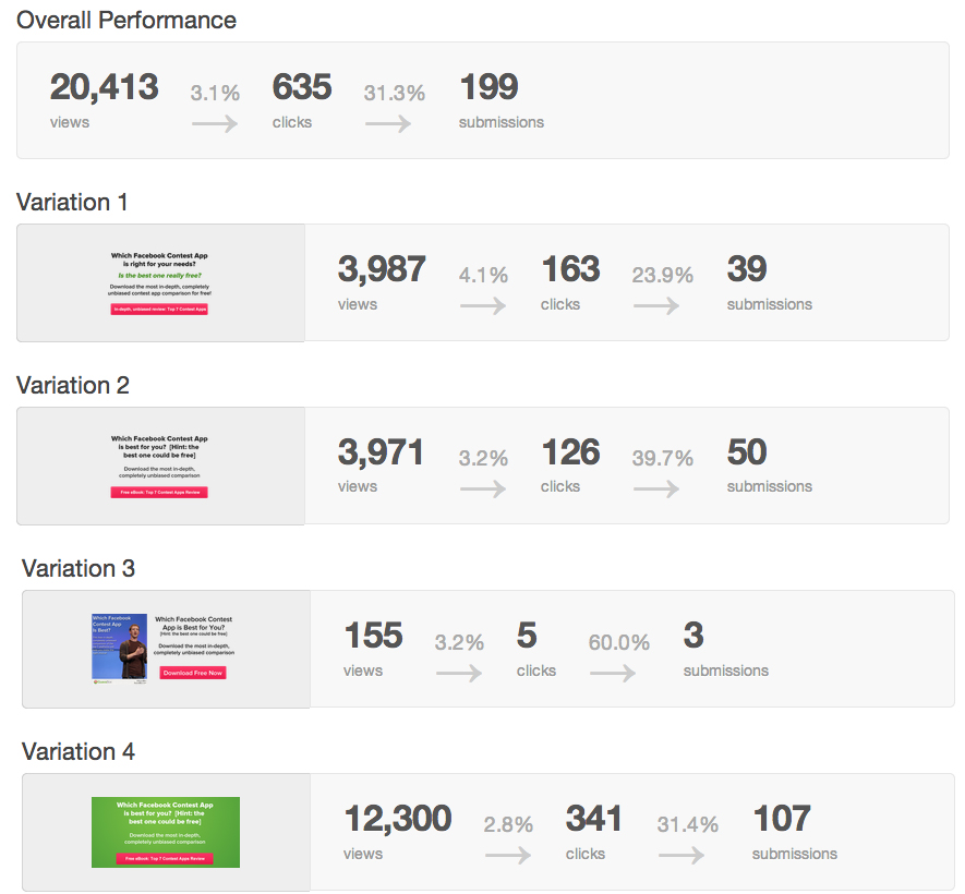
First we picked a blog post that gets a lot of traffic every month, Facebook Contest Apps: Top 5 Apps for Your Next Contest, and see if we could convert more of the traffic into leads. Once he saw that the blog post ranked #1 in Google for “Facebook Contest App” Gray created a highly relevant offer called Facebook Contest App Review. It is a simple offer that breaks down in more detail the pros and cons of different contest apps.
Next we created a series of CTAs to place at the bottom of the post. The purpose of these CTAs was to drive traffic from the blog post and to a landing page where they could download Facebook Contest App Review. We experimented with different background, copy, and layouts to see which design would perform the best.
We found that variation #1 and variation #3 had the highest view to click ratio. On variation #3 we saw a 60% click to submission rate.
Experiment #2: What CTA Format Performs Best?
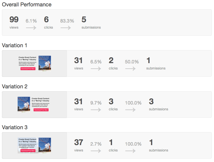
In our second experiment we wanted to get an idea about which CTA format performed better. We used the same sized image and tested the position of the offer cover and a background. What we saw was surprising.
While the views are still low, we were able to walk away knowing that readers don’t like clicking on an image with a background image. Variation #1 and #2 were both designed with a transparent background. Variation #3 has a faded picture of a construction site in the background. This gives the CTA the impression of a banner box at the bottom of the page. Our working theory is that readers can subconsciously see that there is a difference between the copy of the blog post and the copy of the CTA, causing them filter out the block and not read the copy.
No more backgrounds on our CTAs.
Experiment #3
We also A/B tested the Calls-to-Action (CTA) we shared at the end of the blog posts on GuavaBox.com. This brought out some interesting data to help us make better marketing in the future.
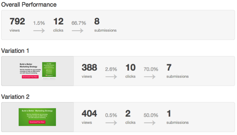
As you can see in the chart below, we created two different designs that linked to The B2B Marketing Checklist landing page. Each one had a similar color scheme and text, but one design significantly outperformed the other.

Take Away
Our biggest take away from these three tests was that a transparent background is the way to go with blog post CTAs. In each test, a transparent background outperformed a background color or image.
We only knew this by testing. If we had just ran with colored CTAs and saw low conversions, we could easily assume that the content offer wasn’t connecting or that the blog copy stunk. Only by running tests on what you’re doing can you really improve your inbound marketing efforts. If you’re interested in learning more about how A/B testing can help you make better marketing, check out Smart A/B Testing for Beginners. In this free guide you will get insight from top inbound experts and learn simple tests you can start running today to measure the impact of your message.


